Sections
The Section widget is a layout tool that allows for more customization options on Advanced Page, Unit Landing, Page, and Featured Story content types, using drag-and-drop content editing. A demo is available to see many of the features of the section widget.
Visual Layout Editor
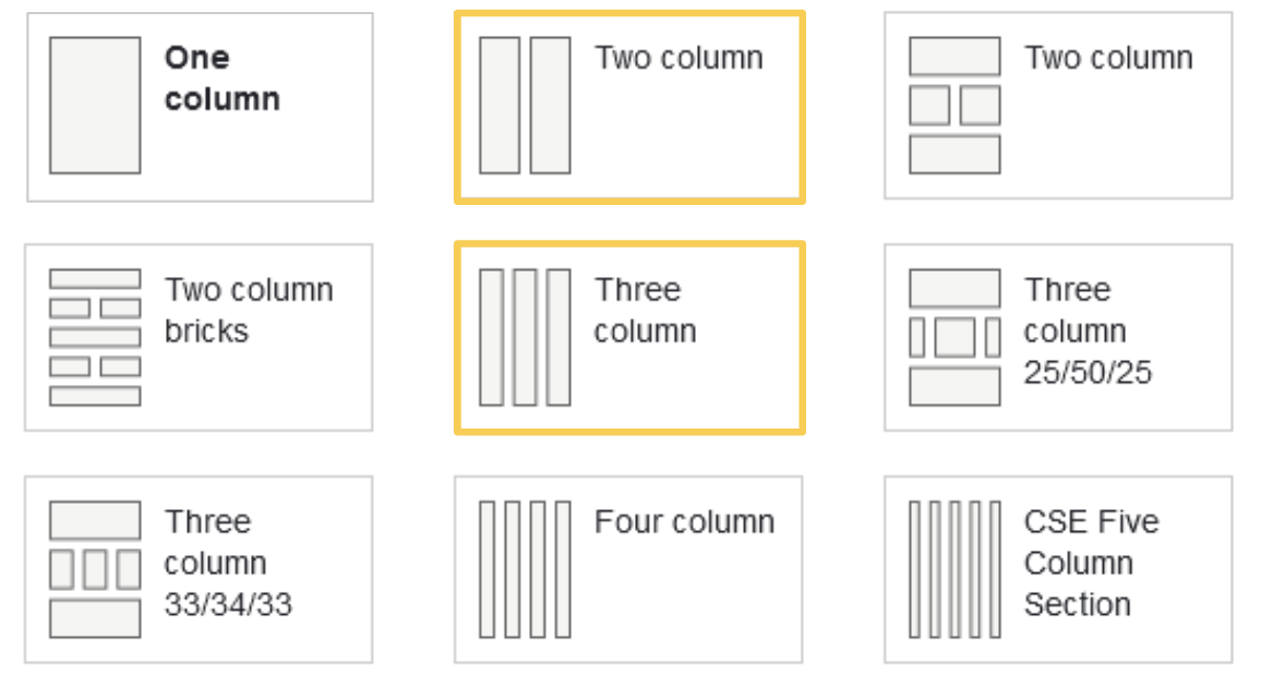
The section widget is a visual layout editor that offers a wide variety of choices. The two- and three-column options include options for column widths.
- Two column
- 50 / 50
- 33 / 67
- 25 / 75
- Three column
- 25 / 50 / 25
- 25 / 25 / 50
- 50 /25 / 25
- 33 /33 /33.
Styling Options
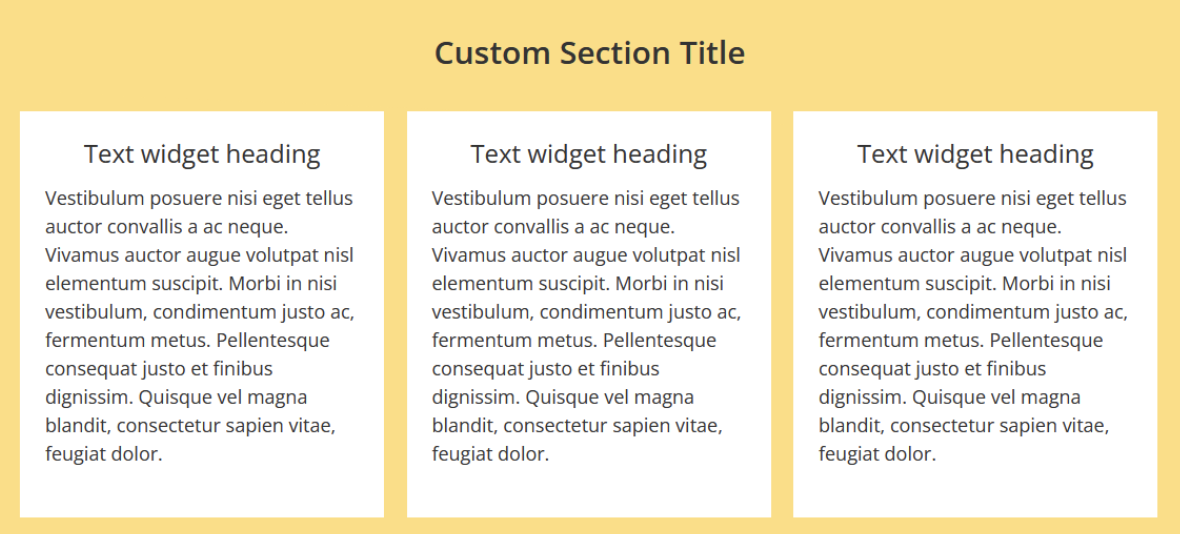
Background Colors
The section widget also provides versatility in background colors. Both the section widget and the widgets within the section have all the standard CSE Web colors: maroon, peach, tan, light gray, grass, gold, blue, slate, white, and image.
Spacing
The Section widget also has options for vertical spacing, default, large, and extra large.

Using the Section Widget
1. Create a new Advanced, News, Featured Story, or Unit Landing page.
2. Once you have chosen your content type, you will brought to the editing page.
3. Under the general information, you will see an option to add a section.
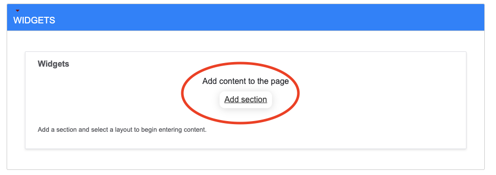
4. A pop-up screen will appear and give you the options to:
- Title the section
- Choose a layout
- Choose options for the layout
- Note: Mainly useful for choosing different widths options for the two- and three-column layouts.
- Select background style
- Select Spacing
- Select a widget angle options
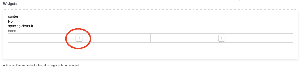
5. Once you have selected your options, click save.
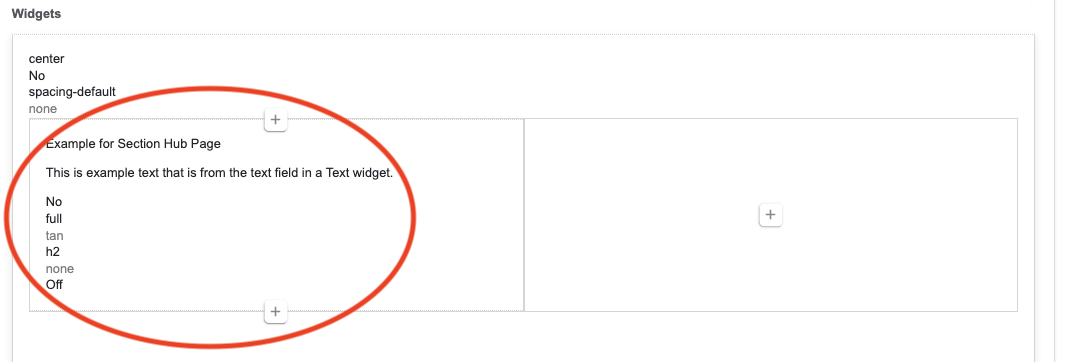
6. A visual layout will then appear in the Widget field of the editing page. Clicking the + in one of the section columns will bring up a list of widgets to choose from.
7. After selecting a widget, a pop-up window will appear with that particular widget's options.
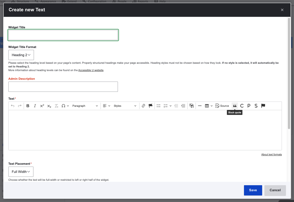
8. After filling out the fields for the widget you selected, it will appear in the section column with summary information.
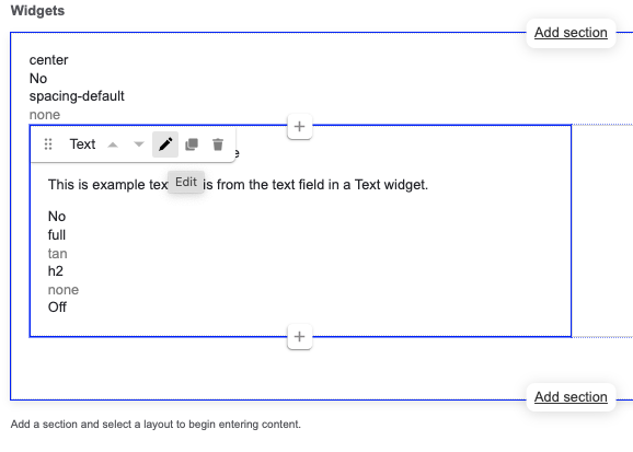
9. To edit a widget you have created, hover over the widget you would like to edit and select the pencil icon.
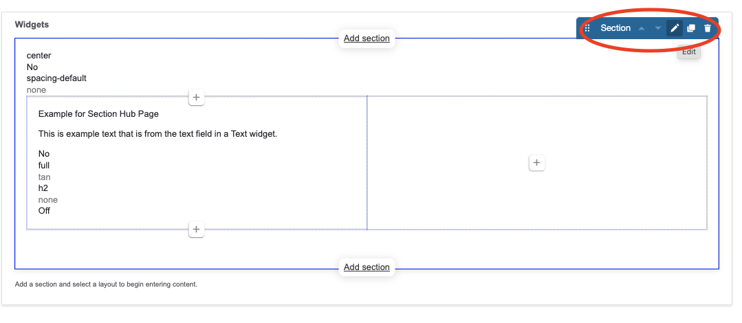
10. Similarly, to edit the section, hover over the section you would like to edit and a tab will appear in the upper right corner.
11. You can add as many widgets to each column as you need, and you can add as many sections to each page as you need.