Images and media
To learn how to upload and add images to a page in Drupal, revisit the CSE Drupal Canvas Training.
If you need access to the Canvas course, email [email protected] and request to be added.
Customizable Image Settings
Images added to a page using the Media Library button in the CKEditor allow for some display setting to be customized using the Folwell styles.
NOTE: When inserting an image, please avoid copying and pasting an image URL to the text editor. Though this will display an image, it creates HTML that needs to be removed from the site. Additionally, if there are changes to the image URL from the host site, the link will break and the image will no longer display. Best practice when inserting an image into the CKEditor is to use the Media Library button.
Click on the media toolbar above your image to customize settings. The media toolbar allows the following image customizations.
- Captions can be toggled on or off.
- Images can be linked to a webpage.
- You can override the alt text of an image.
- You can select from a list of standard sizes.
- You can select the alignment of the image.
Keep in mind that the image size in your WYSIWYG may not reflect the actual size of the image on your page. You must save your changes in order to see what the actual image size looks like on your page (if editing a published page, you can always save as a draft first to avoid publishing the changes before you're ready).
Accessibility Features
Override Alt Text
When you upload an image to the media library, there is a required field to provide alt text. This alt text is used globally across the website wherever that image is used. In some instances, you may want to customize (override) the alt text to give better context to the content on a page. To override the alt text, perform the following steps:
- Click on the image in CKEditor to bring up the media toolbar
- In the media toolbar, click on the icon shaped like an eye
- In the field labeled "Alternative text override", update the alt text to your new custom description.
- Click the checkmark button to save your changes.
Decorative Images
A decorative image is an image that does not add any meaningful information or context to the content of the page. In other words, the image is purely for visual or aesthetic purposes. Decorative images should typically be used sparingly. Examples of decorative images include:
- Icons, graphical elements, or stock images used for only visual appeal.
- Logos or images where the meaning is already conveyed through nearby text on the page.
Examples of images that are not decorative:
- Informative images that provide key information not otherwise provided in the page’s content.
- Images containing text, such as infographics or marketing-style images. The alt text should describe the text in the graphic.
- Complex images like graphs, charts, and diagrams. Alt text should be used to briefly describe the data and additional details should be provided in the page’s text.
- Images that provide context or emotion and contribute to the understanding of an article, story, or message.
- Images that identify people, places, or objects
Please note: Images that are marked as "decorative" may still be flagged in the Editorially tool. This warning prompts you to manually review the image to determine whether it should be marked as decorative or if it requires descriptive alt text.
How to make a decorative image in CKEditor
Step 1: Click on the image in CKEditor. This will bring up a media toolbar.
Step 2: On the media toolbar, click the button with the icon shaped like an eye.

Step 3: Click the field labeled "Decorative Image" to toggle on the decorative setting

Step 4: Save your changes by clicking the checkmark button

Featured and Widget Images
You can also add images within widgets or to a basic page using the Add Media button. The button appears in the Featured Image section of the Images edit tab on basic pages and in multiple widgets, including the Portal Group and Folwell Slideshow widgets. These widgets have predefined display settings. For best results when working with one of these widgets, review our list of recommended image sizes.
Change a Featured or Widget Image
Once an image is selected, the Add Media button will be replaced with a preview of the selected image.
To change the image, click the x button on the upper right of the image.
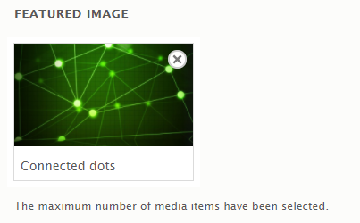
- The image will be removed allowing you to select a different image.