Banner header
The banner header is a specialized widget designed exclusively for unit landing pages. It is a required component on these pages and consists of four elements:
- Banner Image
- Title Text
- Lead-in Text
- Optional Callout Buttons
Example of a Unit Landing Banner Header
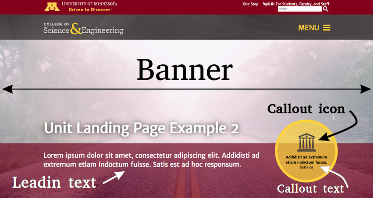
Banner Header Components
The banner header is made up of three primary components:
- Banner:
This is the background image of the header.
Recommended size: 2000x885 pixels - Lead-in:
Text that appears beneath the page title on a background. You can select one of the following background colors:- Gold
- Gray
- Red
Callout (Optional):
Circular buttons used to emphasize content or link to other pages. You can configure:- A single large callout
- Up to three smaller callouts
Each callout allows customization of:- Icon
- Text
- Link
How to Edit the Banner Header
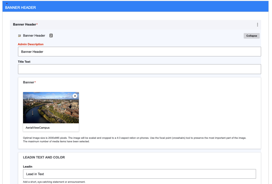
To edit or add a banner header, follow these steps:
- Open the Editor:
- Click the Edit button in the banner header section to modify an existing banner.
- If you're creating a new unit landing page, click Add Banner Header to create an empty banner header section.
- Banner Section:
- Upload a banner image in this section.
- Lead-in Text and Background Color:
- Add overlay text by typing into the Lead-in field.
- Create a link under the lead-in text:
- Enter the URL in the URL text box.
- Specify the link name in the Link Text field.
Choose a background color from the Lead-in Background dropdown menu.
Note: The callout button color matches the lead-in background color.
- Callout Link Options:
- Create circular callout buttons on the right of the overlay text bar.
- Single Callout:
- Click Single Link Setting for one large circle callout.
- Enter the URL and link text in the appropriate fields.
- (Optional) Select an icon to display above the callout text.
- Multiple Callouts:
- Click Multiple Link Settings for 1-3 small callouts.
Fill in the desired number of URL and link text fields for the small callout buttons.