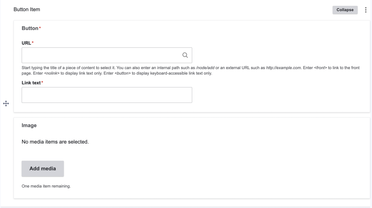
Folwell Button Group
What is it?
A Folwell Button Group is a widget that allows you to group buttons together in various different numbers and styles without having to use the two- or three-column widget feature. There are options to include standalone buttons or buttons with images (see below example). You can find more style options and accessibility and usage info on the Folwell website.

How do I use it?
While editing an advanced or unit landing page, navigate to the widget drop-down menu and select "Folwell Button Group." Click the gray "Add Button Item" button, and fill out the URL, link text, and optional photo fields.
The Button Group widget functions similarly to a portal group widget. Your images will automatically be cropped to the same size. If you add three buttons, they will appear in a row like in the example above. Four buttons will appear in a 2x2 grid.
